So I have a confession to make.
I rarely post anything about Digital Media on this blog.
This is bad because this is a blog for Digital Media.
So to correct this, I am going to post some stills from my stop animation movie.
My movie is about a lovable teacup
This:
is Teacup... she doesn't have a real name, which is sad.. so if anyone has any valid ideas.. let me know :) In my movie she is making herself a cup of tea, because she is thirsty. She goes on adventure encountering surly characters such as this gentleman:
(That is the water pot- he has anger problems)
So Teacup has to brave water pots and sugar cubes to make itself tea and everything seems perfect.. or is it?
I am happy with how my project is going.. it isnt quite finished, I still have to shoot the ending, but I am confident that it will be a fun and endearing movie. I mean, come on, who can be angry after looking after this face??
30 November 2009
23 November 2009
J'adore Kurt Halsey
Now, I normally really love art that is realistic and detailed. My favorite pieces of art are usually photographs and hyper-realistic portraits and paintings. That being said, loving Kurt Halsey is off character for me. His work is cartoonish, but not childish. And where most cartoonists or illustrators hop into bed with Mass Media and exculsively use bright colors, Kurt Halsey's coloring technique is achieved using light ink washes.
I think his pieces are beautiful, endearing, and romantic. They often used text and the words he writes only add to the piece, never detract.
I am not really sure why, but Halsey's work is probably some of the most beautiful art I have ever seen. Not to question its beauty it is just that it is not the type of art I am usually drawn to. My favorite piece of his is Washed away (or at least at sea, assume we are dead).
break my heart. That is my best response to this piece. I think it is simple, beautiful, and lovely. I guess I am just a sucker for love?
10 November 2009
Art For Change- College style Part 2
OK so I survived another bout with the madness that is learning a new software every two weeks.. This time it was illustrator, and I am not going to lie, I didn't learn that much :/ I mean, I knew enough to get by, but I def didn't come out of it an Illustrator genius. I guess lesson learned with this project was simplicity is always best when it comes to marketing. I mean, if a person can't get what you are trying to say immediatly then the poster won't make for an effective campaign. I also learned that asking for help may sometimes leave a bitter taste in you mouth, but it makes your work better.. so with that in mind - thanks Alanna and Kirsten for explaining how to get that stupid white box off from around my vulture :) But enough musing and Oscar acceptance speeches--
So this is my poster :) my concept was suicide. I didn't really go into this hoping to bring awareness but more to call attention to the fact that this is something everyone deals with. That is why I chose the text "we all flirt with the tiniest notion". A majority of people at one time or another have or will toy with the idea of self harm or even suicide. That is what this poster was about. Suicide isn't always commited by depressed, hopeless people. Sometimes it is people who seem ok and perfectly happy. That is why I thought it was so important to make this poster- to hopefully create a message of hope and unity :)
09 November 2009
What Happens When... Part 2
What Happens When... I watch Project Runway on On Demand...
I don't pretend to be a fashion designer, nor do I think that that is where my true talent lies. I sometimes like drawing outfits and fashion and it is something I used to draw a lot when I was younger. When I was in middle school I even created my own fake catalogue and looking back on it, it was terrible. But it has been cool seeing how my art has developed from middle school to now. So yeah, I hope you enjoy my novice attempts at fashion design :)
So sometimes I like to draw while I am watching tv. When that happens, I usually get inspired to draw in the style of the show, or even draw what is being talked about on the show. That happened last week when I was watching Project Runway...
I don't pretend to be a fashion designer, nor do I think that that is where my true talent lies. I sometimes like drawing outfits and fashion and it is something I used to draw a lot when I was younger. When I was in middle school I even created my own fake catalogue and looking back on it, it was terrible. But it has been cool seeing how my art has developed from middle school to now. So yeah, I hope you enjoy my novice attempts at fashion design :)
Interesting Art Technique Installment 2
Welcome to the second installment of "Interesting Art Technique"! The techinque I will be focusing on in this blog is called Suicide Relief printing. It is a printmaking technique that is often used with a linoleum block. The process starts with a blank piece of linoleum. To create a suicide print you need to have a multicolored rough draft, for example, an apple. A more specific example would be a red apple with white highlight, green stem, and white background. The first thing you would carve away would be the white background and the highlight. You would then print many prints in the next lightest color, green. After you printed all the green you would then carve anything that you would want to keep green away, leaving the pieces that you want red behind. You would then print red to complete a simple suicide print.
This a suicide print that I did a few months ago. It had 5 colors to it, and was a very long process. But I think it turned out really nice and it was one of my favorite projects in printmaking class. So yeah, I think that this process is a really interesting technique and something that would good to blog about.
What happens when... Part 1
So I am very inspired by things in my life (I feel like a lot of people are but that is not the point). A lot of the things that inspire me are poetry, songs, some tv shows, and other random things. But sometimes, I just draw and see what happens. That is what this set of drawings are. Pictures that I made while waiting to eat lunch, or waiting for Colloquim, or just waiting for something, anything. So yeah this is what happens when I have a few extra minutes and a little untapped creativity... :)
02 November 2009
Design Project- The Pain in the Butt That Was the Alphabet.
So the last design project I submitted was a photography based one. I had to find all the letters of the alphabet, in nature, and photograph them. I mildly hated the project but I think the finished project is pretty legit.
ps- I did lowercase to challenge myself.. I was thoroughly challenged.. :) enjoy!
pps- I have no idea what happened to z..
ps- I did lowercase to challenge myself.. I was thoroughly challenged.. :) enjoy!
pps- I have no idea what happened to z..
Art For Change- College style
Ok so...
my newest digital media project is another computer based one. Our objective is to create an 11x17 poster that deals with a social issue. I also have to incorporate two lyrics from a song into the poster. I really like this project and I am excited to see how it turns out. The topic I am addressing is suicide. This is a really serious issue, that a lot of people know about. My approach to this project is less about exposing the issue to people and more about creating a message of hope and community to people who are depressed or considering any type of self harm. In class last week the class was challenged to create a peice only using two words from our lyrics that would effectively portray our topic..
That was my attempt :) I picked the words self and conclusion because that really is what suicide is- self conclusion. I am new to illustrator, that class being my first time using it ever so the poster is a little base but I like it.
ps- more to come! Not the final product, but that will be up here soon (well when I finish it).
Art For Change- oil painting style.
When I found out the topic and objective for my newest digital media project I was super excited. I really like the idea of bringing a social issue to the forefront of someone's mind and kindof raise awareness and get people talking. I actually made a type of art for change in my senior year in highschool. I was going to paint an oil painting that would then be submitted into an art show at a fine arts festival held for all the schools in my school's conference. I decided to create a piece about an orginization called Love 146. Love 146 is a organization that works for the abolishment of child sex slavery and explotation. The organization was started a few years ago after its founder posed as a buyer and actually went into a child brothel. The man was led into a room that was outfitted with a two way mirror. He was looking into a room filled with young girls, all wearing red dresses and a number pinned on the front of the dress. The number was the only thing to identify the girls. All the girls were souless, listlessly staring at nothing- except one. 146. she was staring right into the mirror through the window. Maybe she was new, maybe she was a fighter. The founder wasn't able to save her, but she inspired the foundation. This story inspired me to create a piece, and that piece actually one for best oil painting in the conference show I submitted it in. I really think that art for change is important and one of my favorite things to do.
If you are interested in more information check it out here- http://love146.org
19 October 2009
Interesting Art Technique Installment 1
One of the more interesting techniques that I was exposed to in highschool art was stippling. Stippling is the proccess of creating a picture and shading it using dots. You often start the proccess by finding the picture that you will be using as the subject. If the picture is in color, it is often very helpful to photocopy it in black and white. Next, you draw a grid, often 1x1 inches, onto the photocopy. Then you create another 1x1 inch grid or even a 2x2 inch grid onto a piece of nice paper. You then draw the outline and help lines of the picture onto the nice paper so that the grids match. Once you have transfered the image, you can start stippling. The whole point of stippling is to not make any lines or long marks. Only dots are used to create the outline and shading of the image. You insinuate darker areas with dots closer together and light areas with maybe no dots at all. once you are satisfied with the image you can erase out the pencil grid and enjoy you completed piece of art.
What You Need:
a picture with interesting subject and shading
pencil
straightedge
nice light colored paper
fine point sharpie
finished product:
So yeah, I think everyone should try stippling out! It is a really cool techinique and creates interesting unique pieces.
What You Need:
a picture with interesting subject and shading
pencil
straightedge
nice light colored paper
fine point sharpie
finished product:
So yeah, I think everyone should try stippling out! It is a really cool techinique and creates interesting unique pieces.
12 October 2009
My new favorite artist
In the process of researching and trying to gather inspiration for various projects in the last month, I have developed a love for many new artists. One of them is a painter and illustrator named Alphonse Mucha. He was born in Moravia (which became the Czech Republic which is now a multitude of countries) in 1860. I love love love vintage art and advertisements, and his are amazing. He is one of the first people to paint in the art nouveau style. His art often depicts women and many of my favorites incorporate nature or the seasons.
Dance
White Star
The Moon
Les Saisons
I honestly think that Mucha is my favorite artist right now. I am sure my absolute favorite will change a lot, but Mucha will always be pretty high on the list. His work is beautiful, elegant, and I am a sucker for vintage art in advertisements, so I am hooked on Mucha.
I love pretty things :)
When I first got my camera for school, I spent a lot of time just messing with it. I hate taking pictures indoors so I would always end up outside. This resulted in many confused looks from my neighbors when they would see me sitting in my front yard taking pictures of grass for an hour wearing hot pink pajama bottoms and a tshirt. But all the looks and grass stains were worth it, because I got some really pretty pictures.
I took a lot of pictures of this one plot of flowers, but somehow some leaves got in there :)
07 October 2009
Some of my older work
I really want this blog to interesting and informative about me and my style and process of creating art. I thought that is would be interesting to put up some of my work from highschool on here to show my personal interests and art style. :)
This was a charcoal sketch I did for the portfolio I submitted to the UD. I originally really hated it and didn't want to do it, because I was unfamiliar with charcoal pencils. This is somewhat ironic to me because now all I draw with is charcoal. go figure.
This is what I most often did in highschool. I would find a picture in a magazine and then I would draw it. I have always aspired to be able to draw realistically, instead of going down the road of animation or more cartoon drawing.
The next two pictures are of stipple drawings that I did in highschool. I really enjoyed stippling even though it was tedious. I think the product of this techinique is beautiful and interesting.
All of these pieces were some of my more successful works from higshchool. I really enjoyed all the techniques and processes that I used in highschool and I really believe that they show my personal artisitc style
Peace,
Laura
05 October 2009
On a sortof related note..
I know this is a blog for photography overall, but I really wanted to showcase some of my other art work. One of the new, and super cool projects I am doing right now is in design. It is cut paper and composite project which has a great potential for cool work.
This is one of my favorite peices so far in this semester. I really loved Paris and I love old fashioned advertisements so I was excited to combine them to create a really interesting piece.
25 September 2009
A Little Something Called History
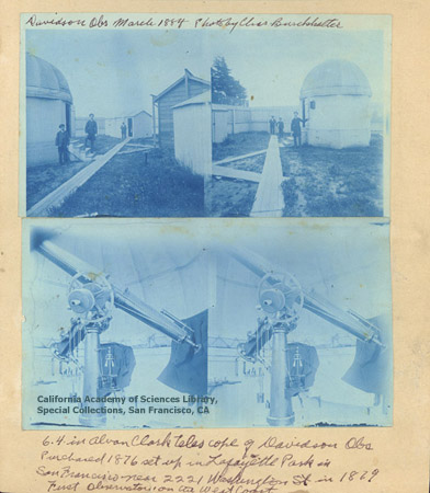
This week in my digital media class we took a feild trip.. it took us about 1 minute to travel the 50 yards between Recitation Hall and Old College, but it was worth the time and effort. My class was treated to a lecture about photography's history. One of the things that interested me were the old cyanotypes of the University of Delawares campus from the mid 1800's. Cyanotypes were invented in 1842 by John Herschel. Cyanotypes are so named for their overall blue hue.
One of the interesting things about cyanotypes is that they are still being created today. Cyanotypes are considered "progessive" now, even though they have been around for over 150 years.
http://www.alternativephotography.com/process_cyanotype.html
One of the interesting things about cyanotypes is that they are still being created today. Cyanotypes are considered "progessive" now, even though they have been around for over 150 years.
http://www.alternativephotography.com/process_cyanotype.html
16 September 2009
Self Portrait
This is a self portrait I took (obviously). It was originally shot in color, but I made it black and white and also increased the sharpness and contrast. I like how the overall look turned out. When I originally took the picture in color, I hated it. It was really boring and just, not that good. But when I put it in black and white, I fell in love with it. I am not really sure what it says about me. I guess it shows how I express a lot through my eyes. Most people think that my eyes are bigger than normal, and they get a lot of attention. I dont know how to explain it, but the picture just says "me" to me :)
Subscribe to:
Posts (Atom)